— Engineered
For The Loop
Project
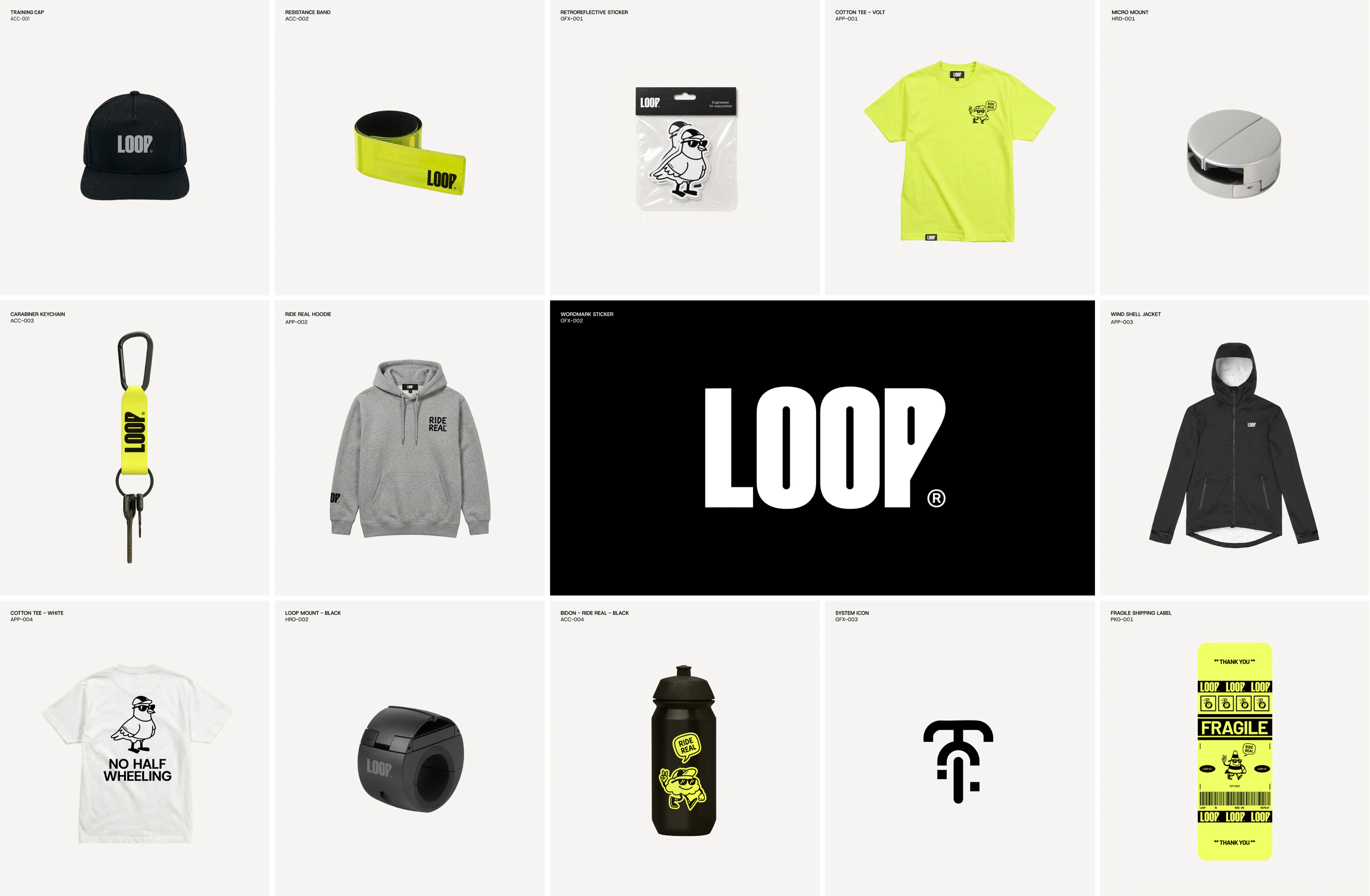
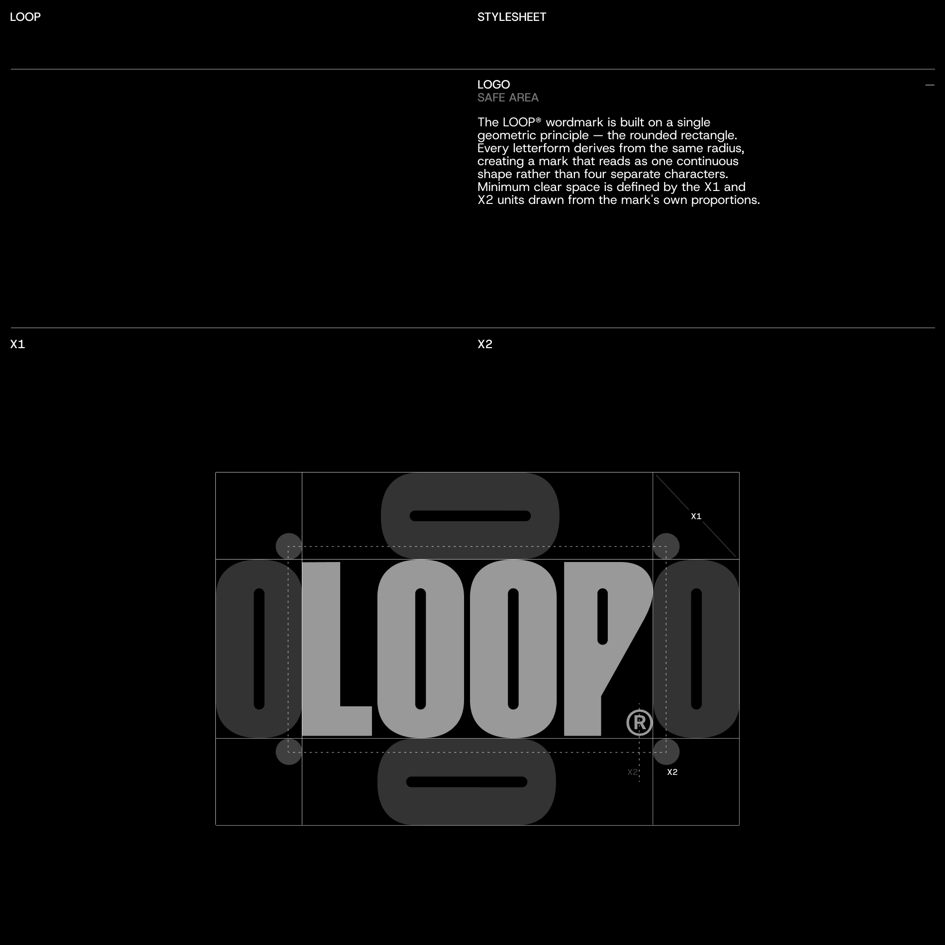
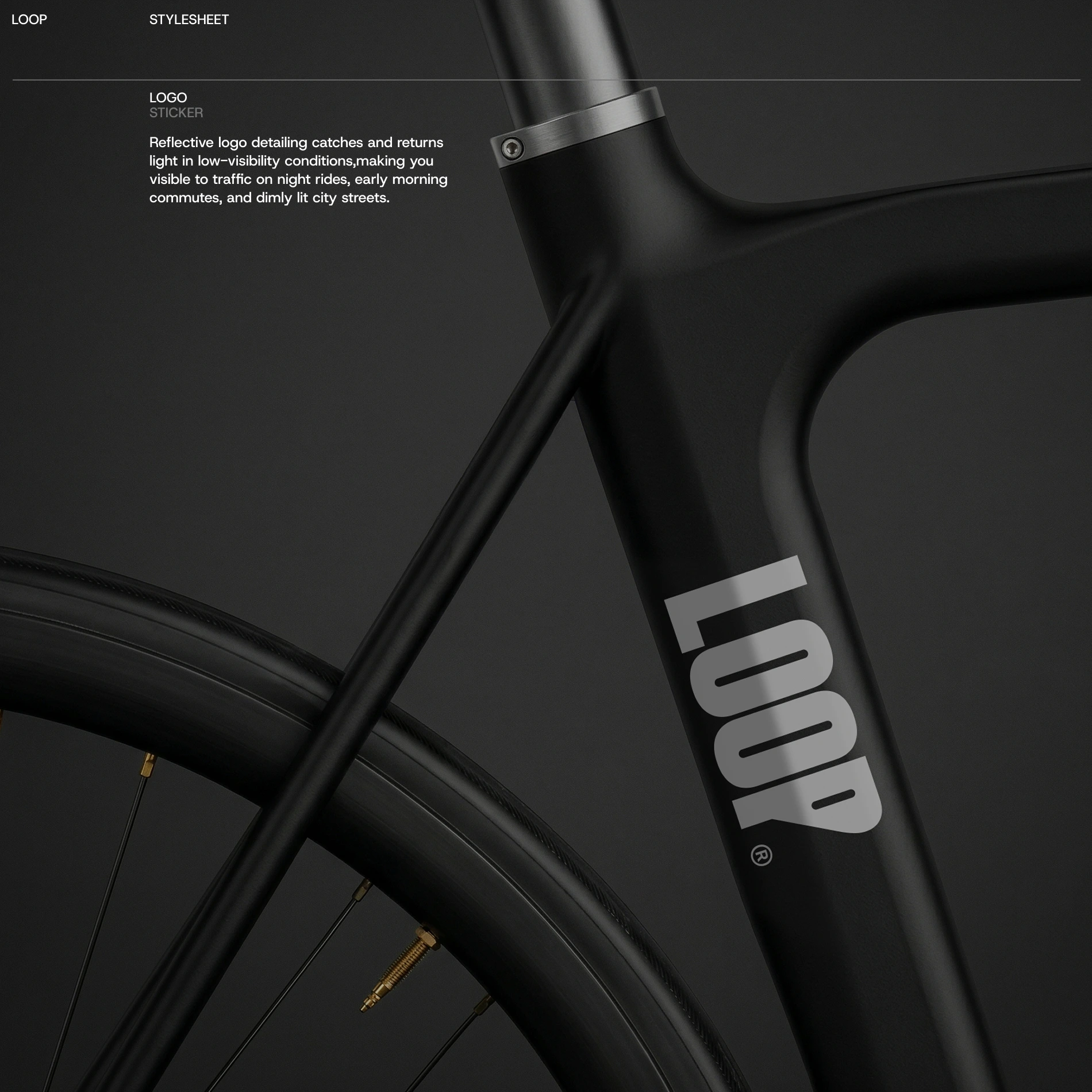
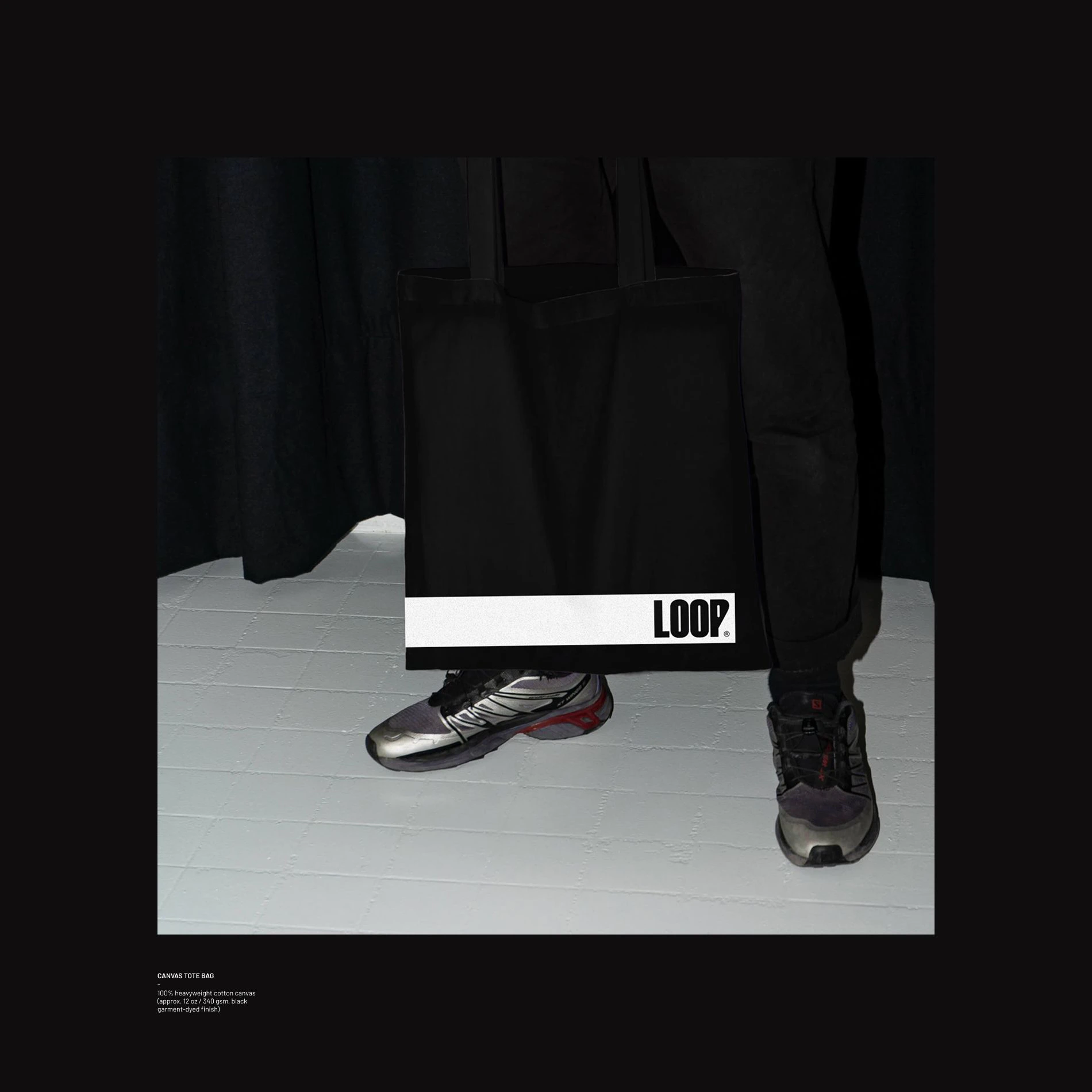
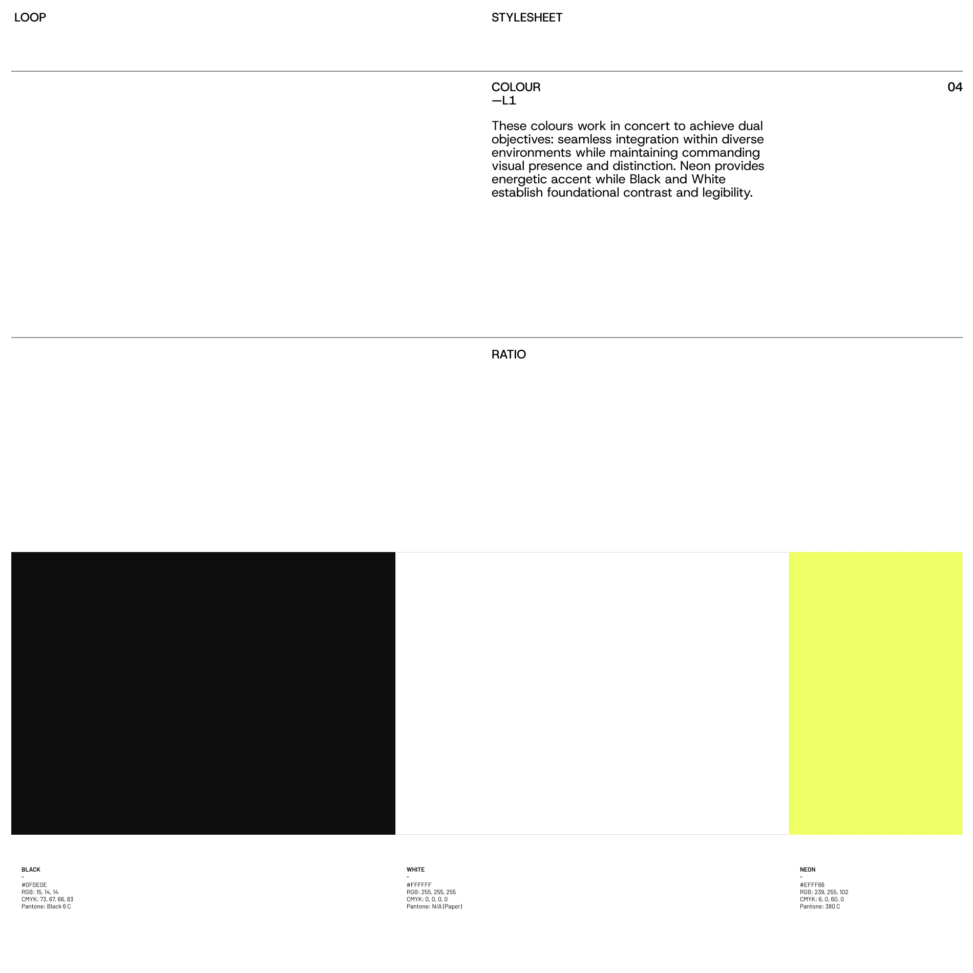
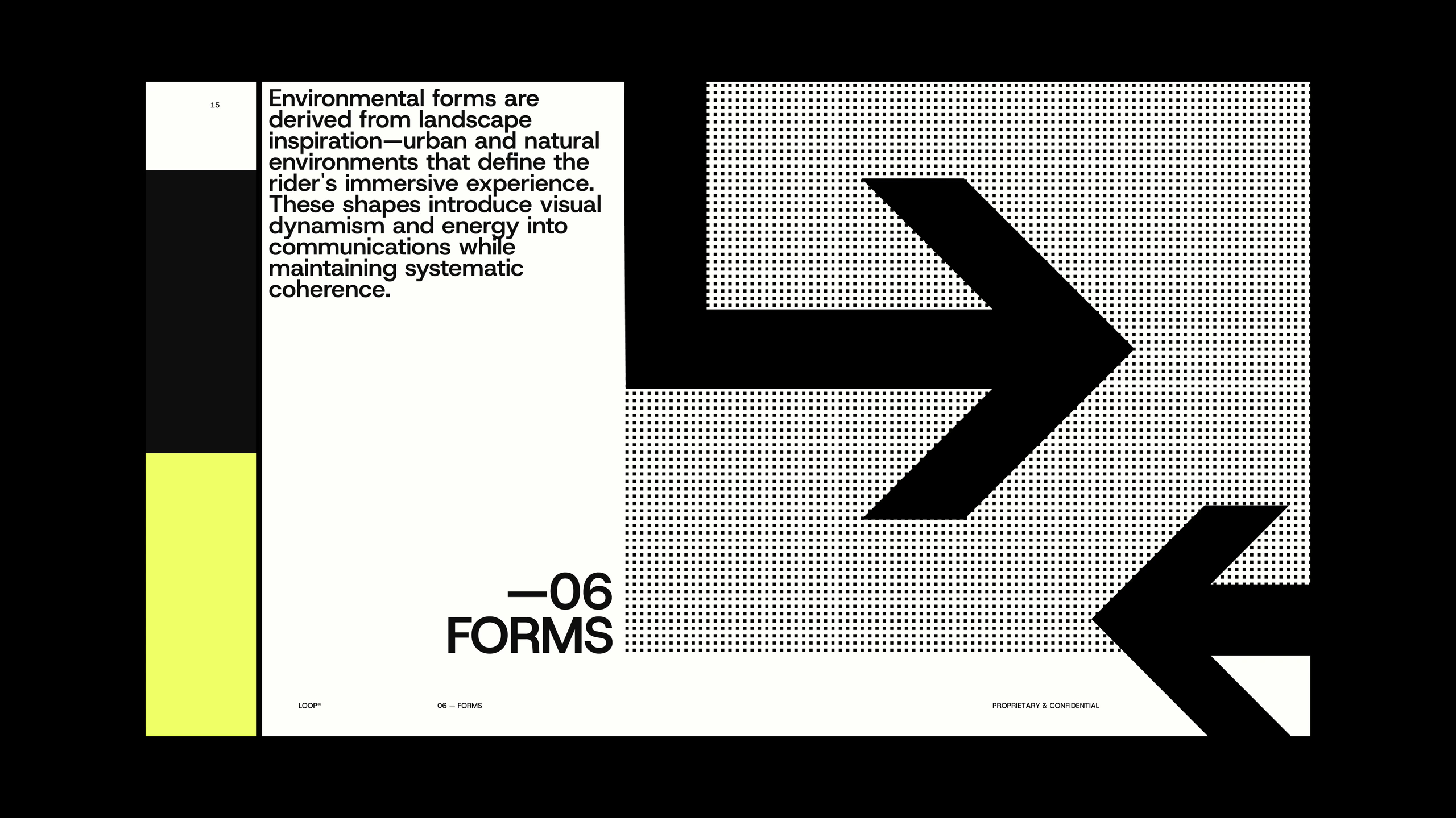
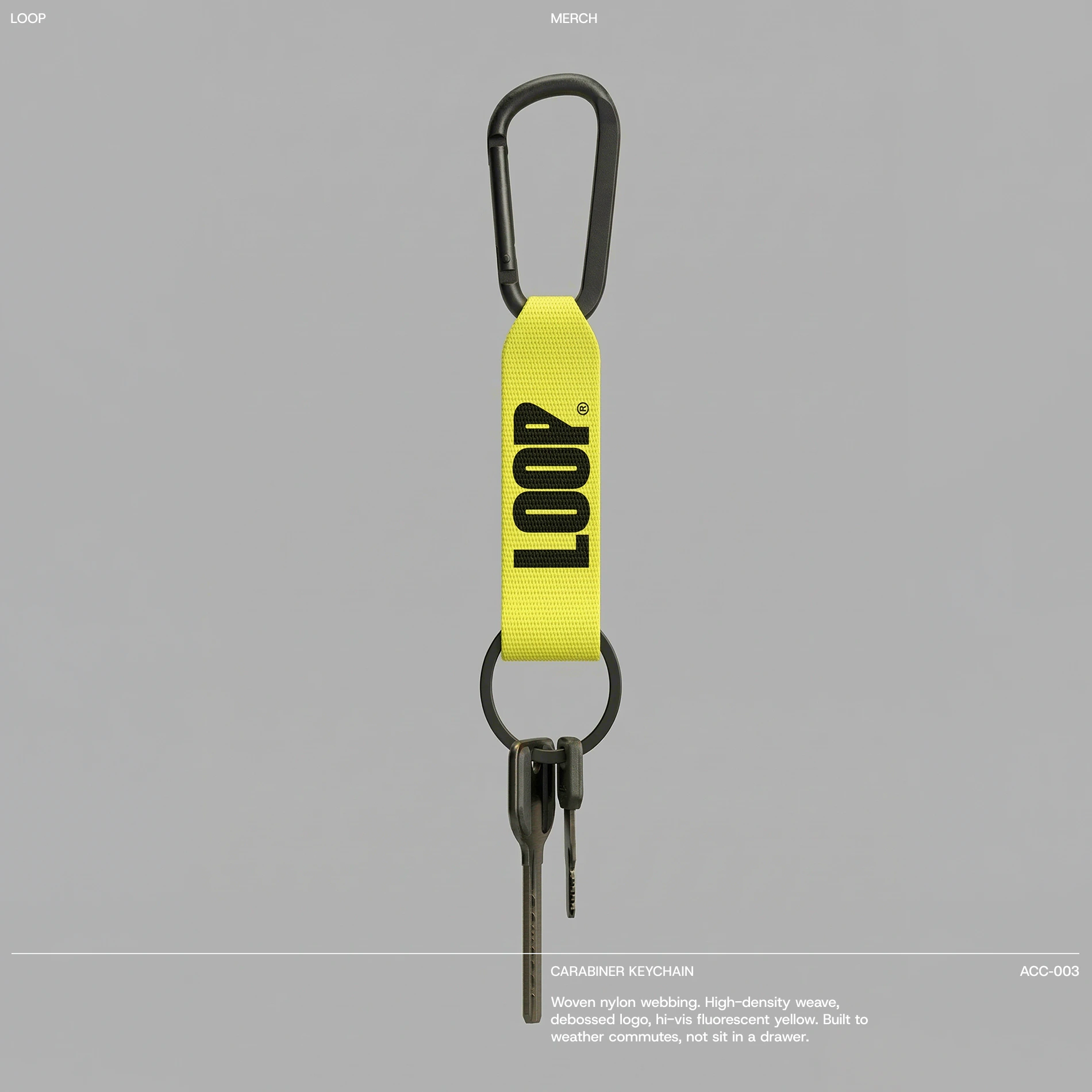
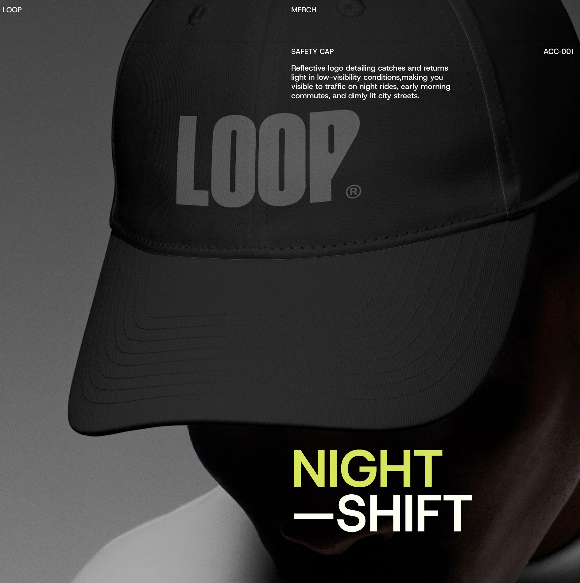
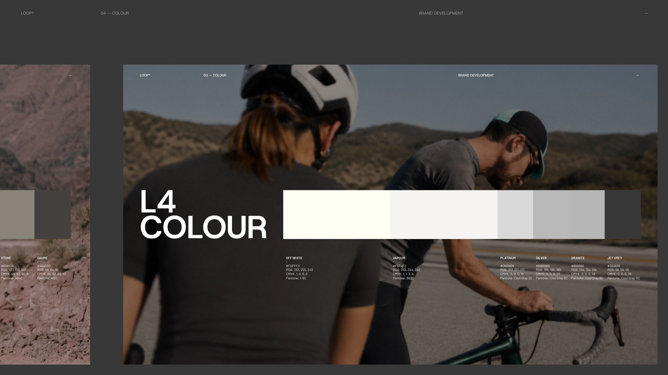
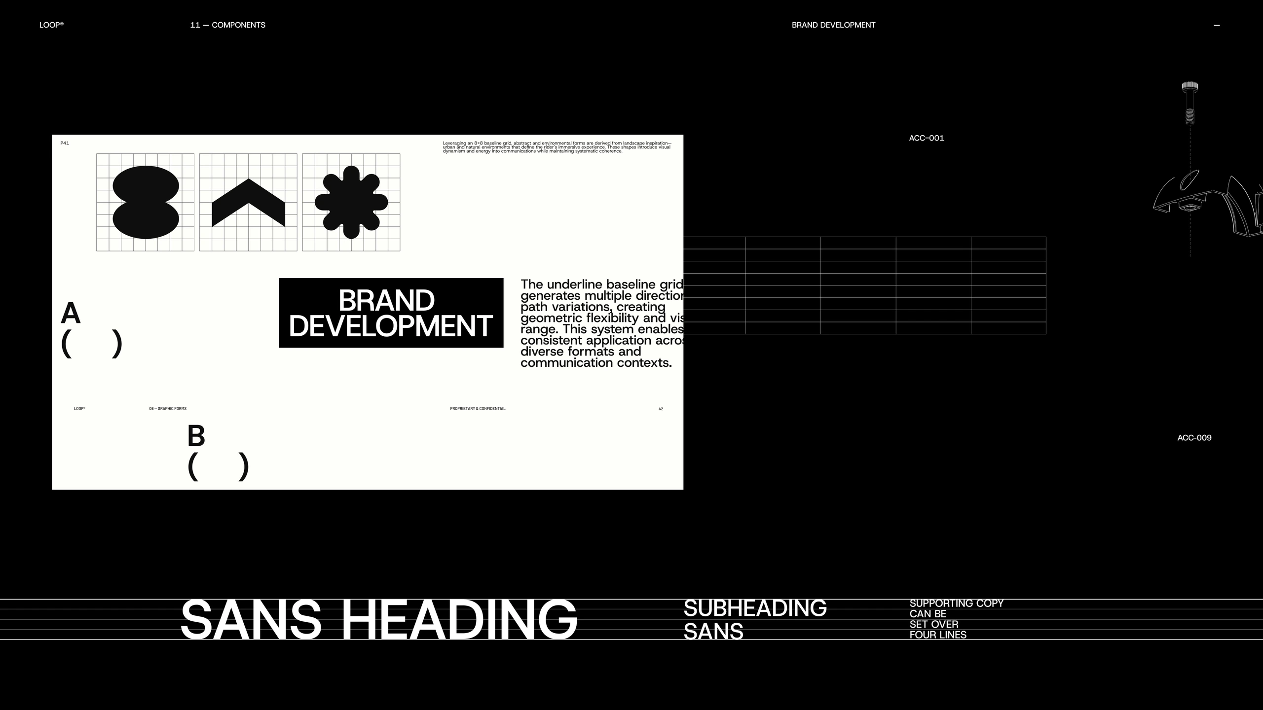
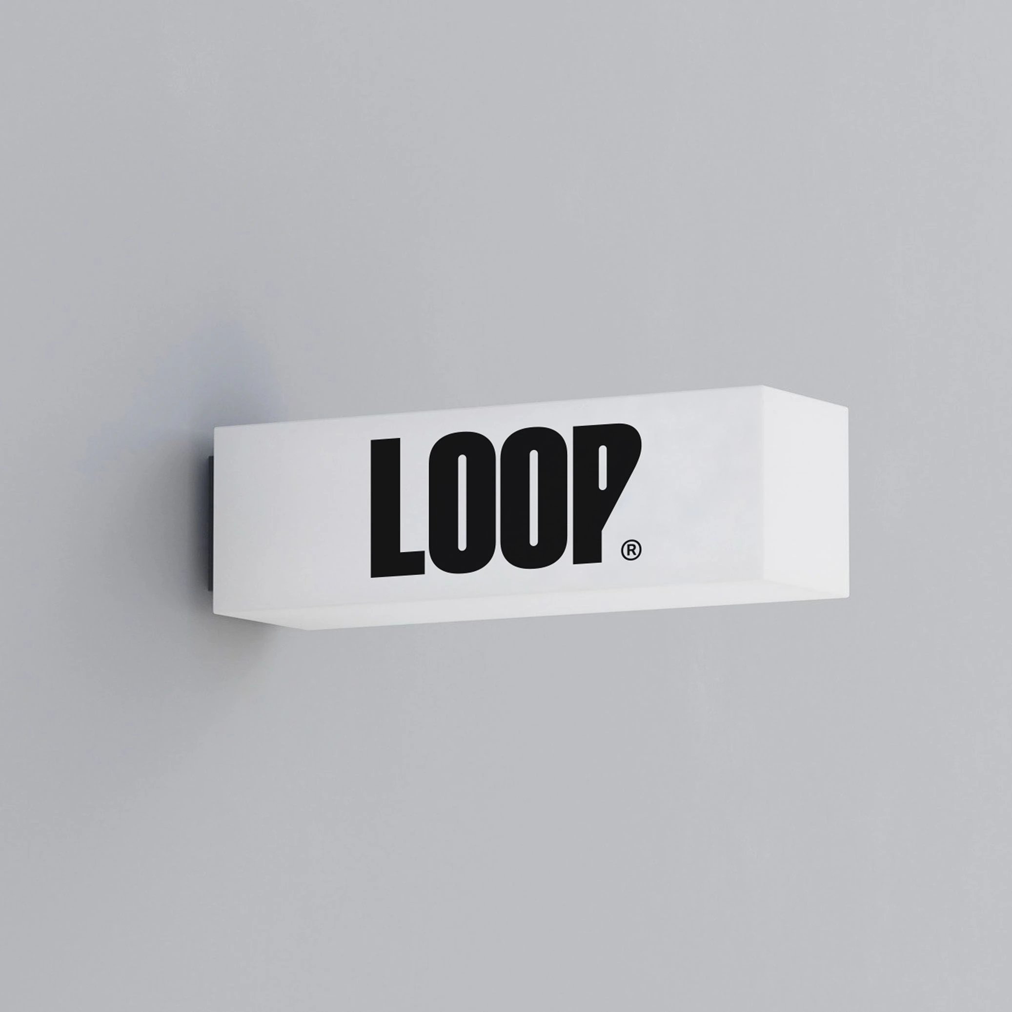
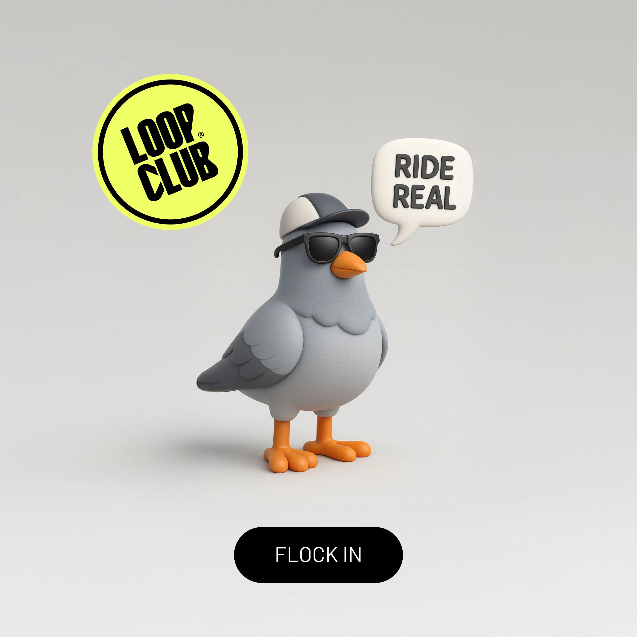
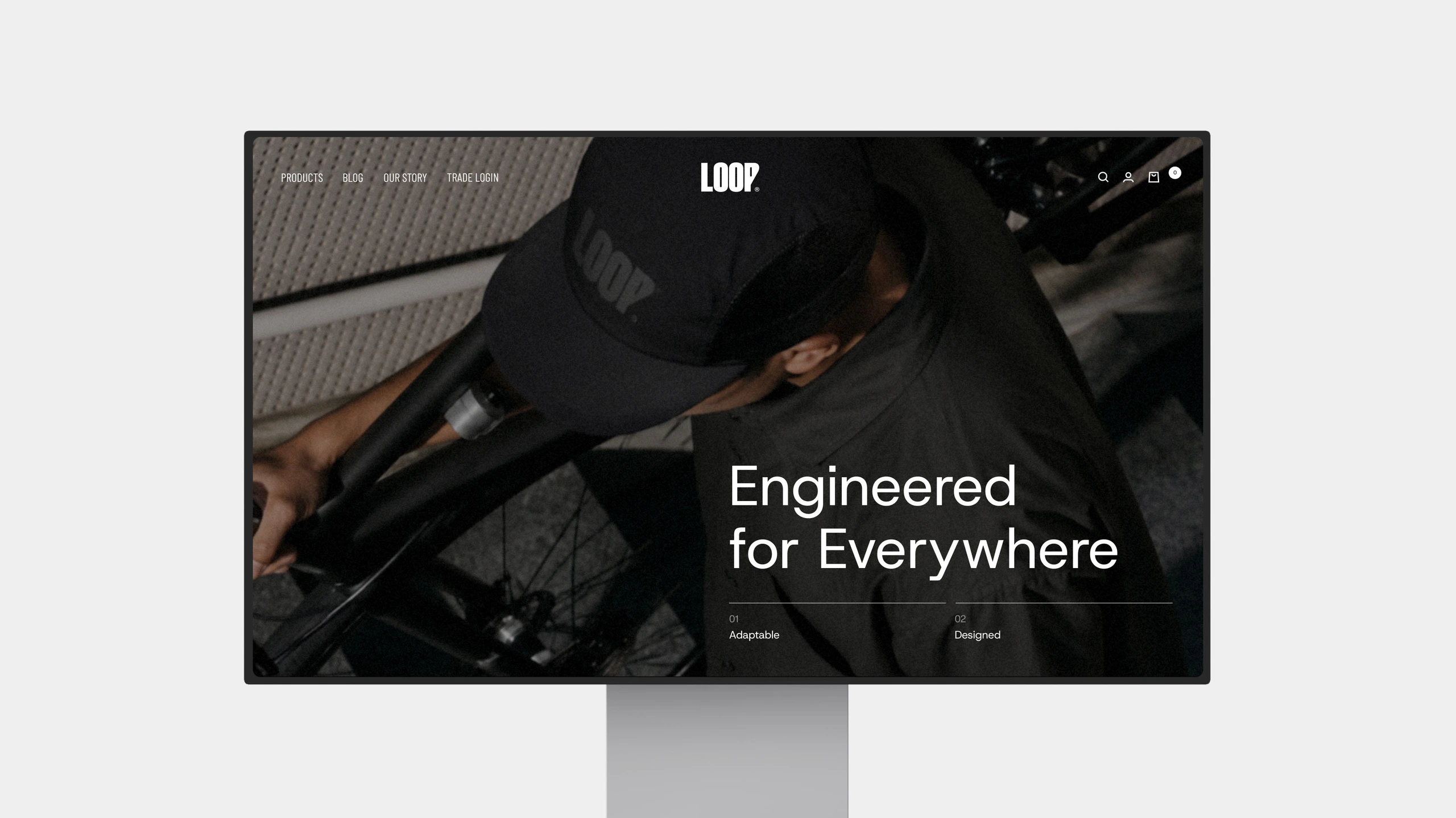
LOOP needed to grow without losing its nerve. The brief was to build a brand platform that could hold two registers at once: the precision of cycling equipment and the looser, community-driven energy of people who ride because they choose to. The visual language answers both. It starts with a bold, compressed type system, customised to the format rather than borrowed from the category, anchored by a high-chroma yellow taken directly from street signage: functional, visible, impossible to miss. The colour palette runs between urban contrast and natural terrain, with a secondary range flexible enough to shift tone depending on context without breaking the system. Recognisable at speed. Built to hold weight embossed, screen-printed or at campaign scale.
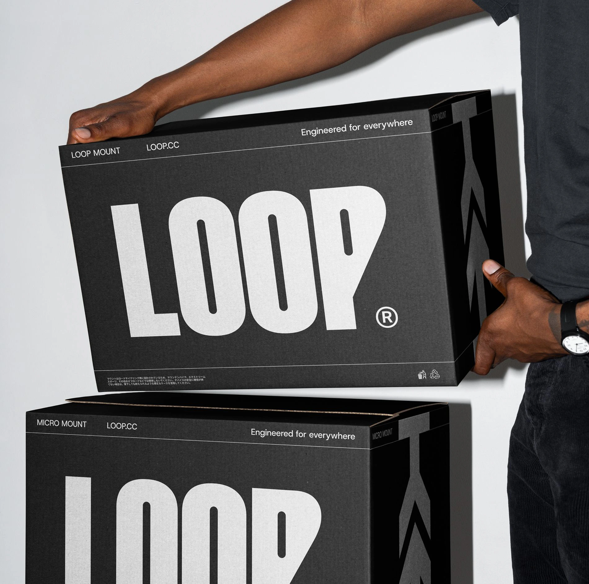
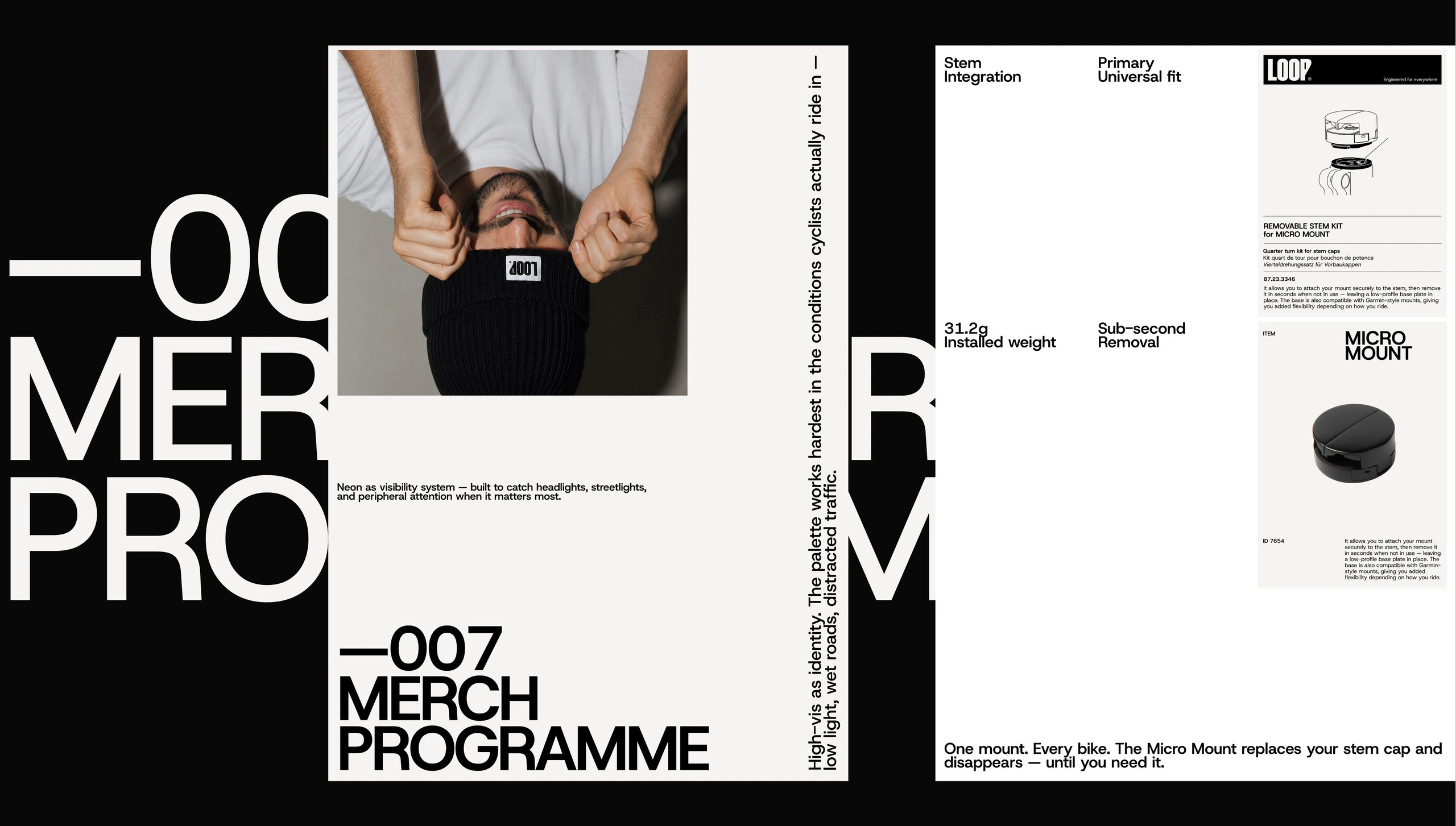
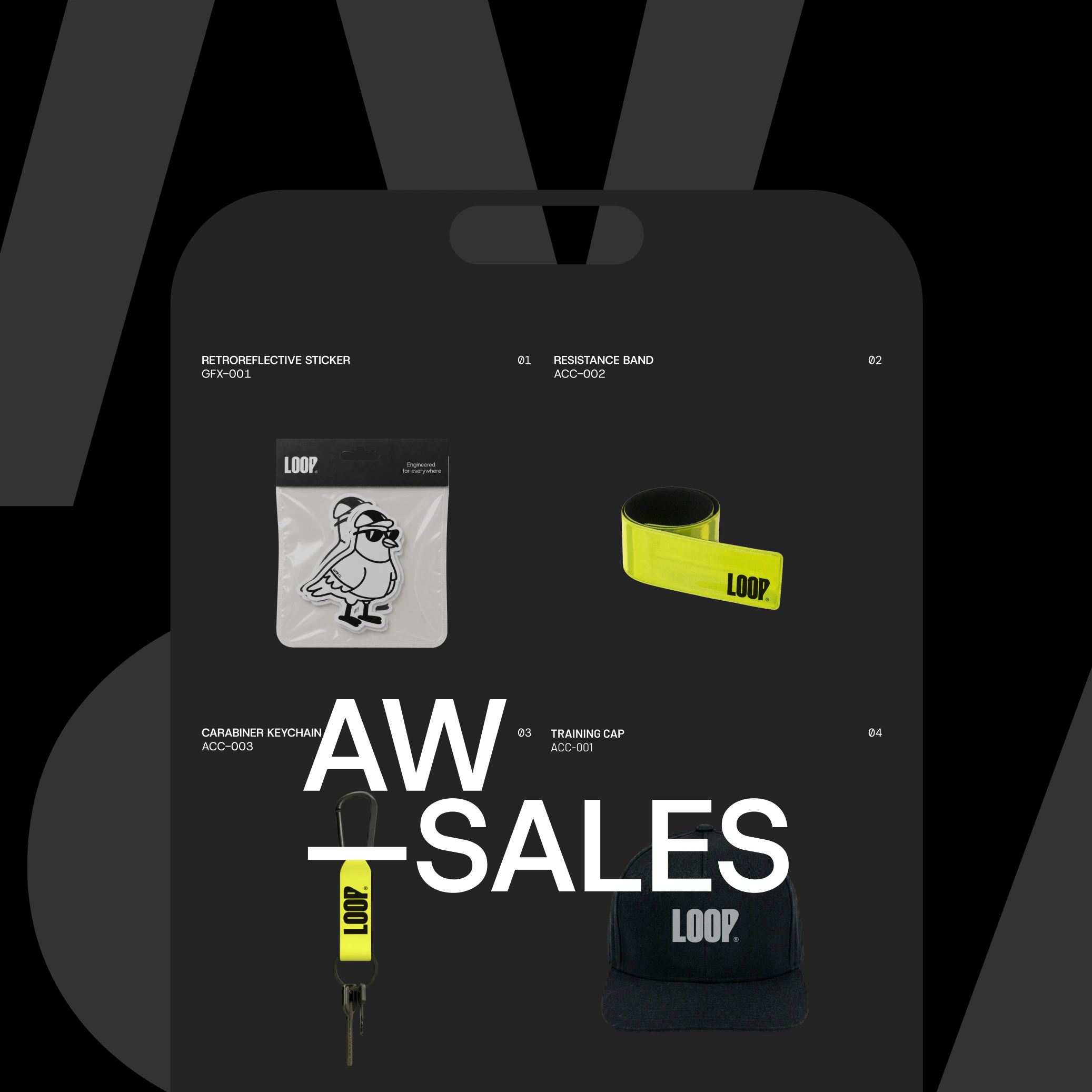
Packaging was redesigned around reduction: fewer decisions, stronger signals, recyclable materials without trading away the tactile quality the product earns. On-shelf clarity was treated as a design problem, not a marketing one. Every physical touchpoint was considered as part of a system, not a series of executions.
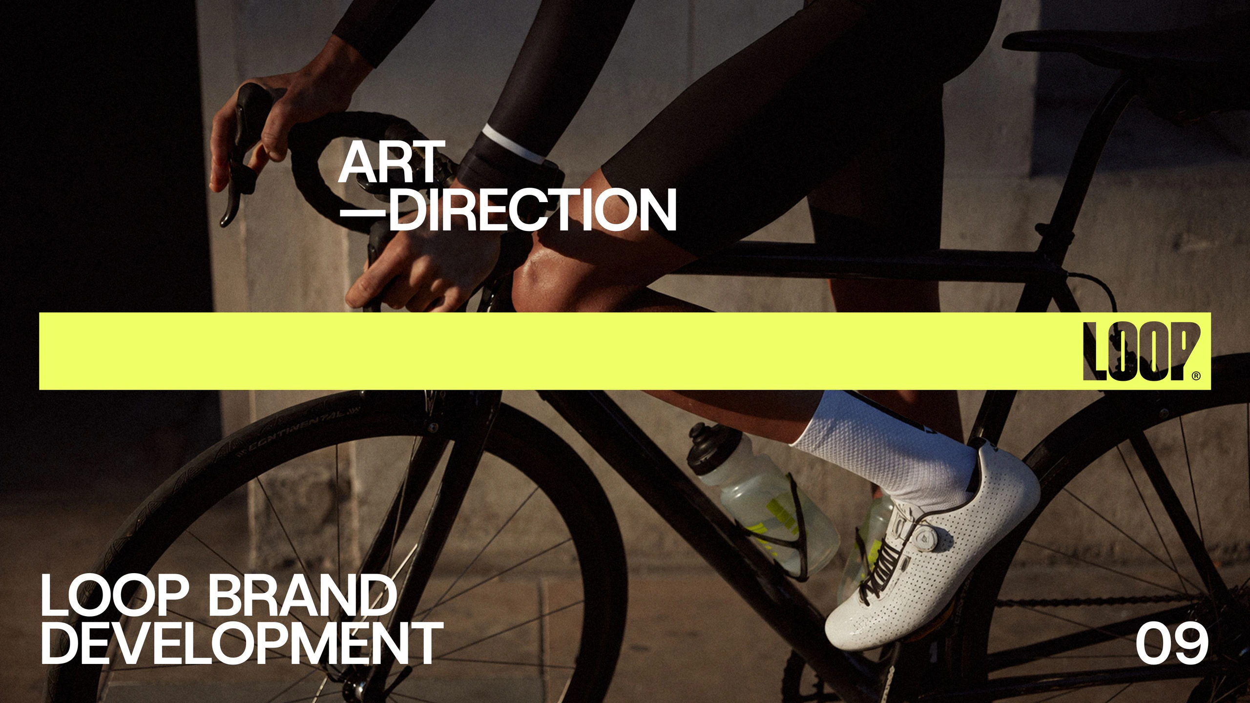
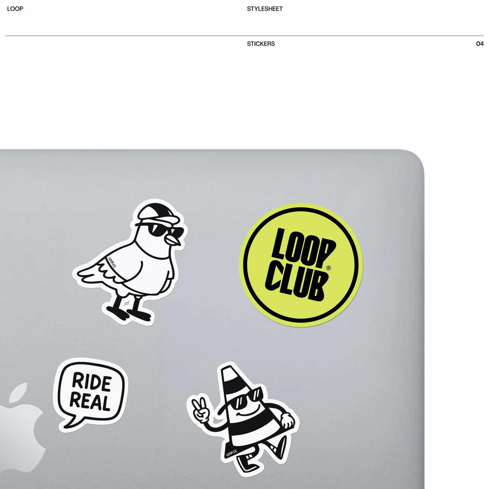
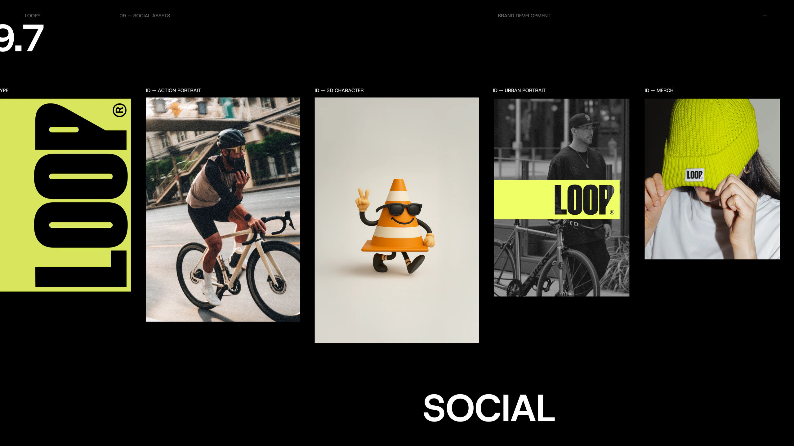
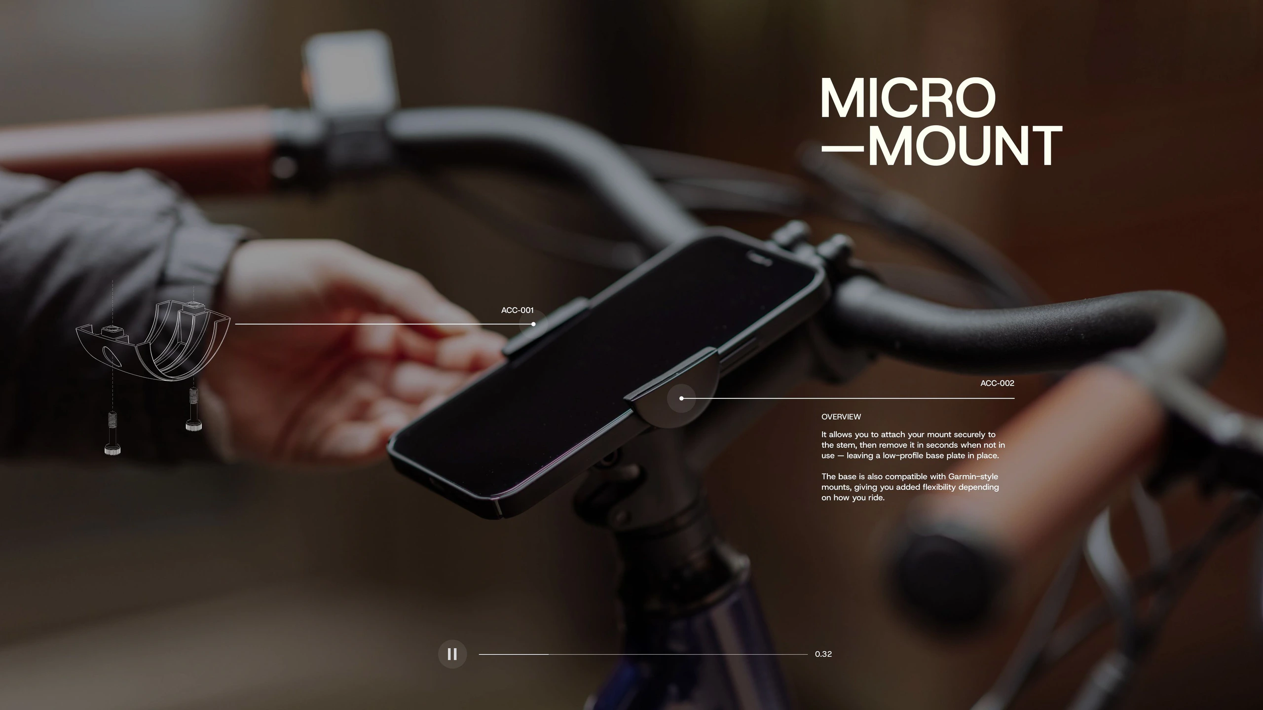
The mascot system brings in the other register. Characters with specific attitudes and messages, each carrying a piece of the brand's personality into the community platform, where the identity can afford to be looser, quirkier and more playful without diluting the core mark. Photography follows the same dual logic: action alongside the laid-back, real riders alongside lifestyle, depicting what it means to be someone who rides regardless of the context. A brand growing larger than its product category, built to hold that ambition from the start.
Role
Brand Design & Design Direction
Studio
Freelance
Output
Brand Strategy, Brand Identity, Brand System Design, Art Direction, Marketing Design, Packaging Design
Enginuity™
MONO Recorder
[Coming Soon]
Targetstar
AmaWaterways
[Confidential]
NielsenIQ
Approach
Jio
Leica
Coca-Cola
LCID
Supmates NFTs
IKEA
Disney